
Today I started work on my poster and advertising design for my hypothetical Wes Anderson Film Festival. I had a few initial ideas in mind, though nothing set it stone- aspiring to work with vector based logos to reflect the style of my existing products.


I began working with my six-swatch colour palette and incorporating these into my designs through blocks of colour, illustrations and type. Although I thought some were quite promising (I quite like one of the initial ideas- with the white vector illustrations over the vertical swatch bars) I think they still looked a little childish, and didn't represent the audience, the films, and their substance very well.


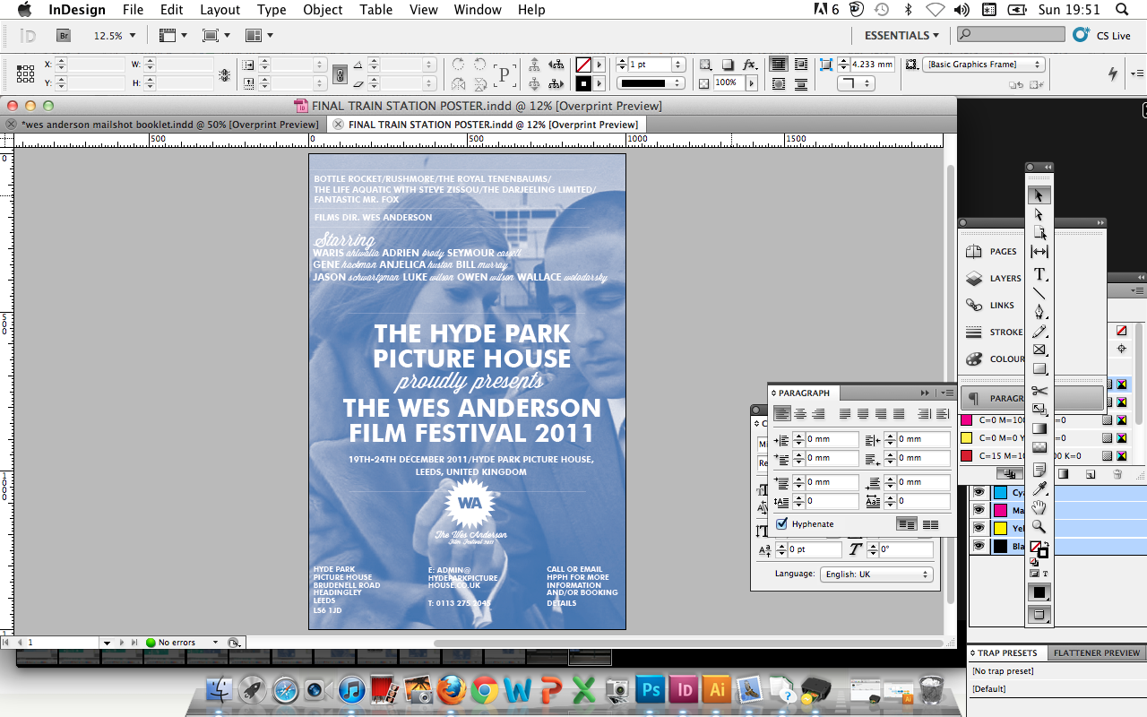
One again, like the beginning of my project, I returned to duotone images. Before, when using these I felt almost as if I were cheating- the images already being provided for me- that I perhaps wasn't putting enough effort it, but now I realise this really is the best way to communicate the films- the style reflective of a contemporary art house film or indie publication- something that I hoped to put across, whilst still not being too serious or drab. I played around with content and style as well as colour, and found that the "Tenenbaum blue" (Pantone 2935 U) worked best- as in my original designs (starting to make a habit of returning to ideas... but making them better!).


The bottom of the design still looked a little plain, so I went on to add the Hyde Park Picture House logo- although I couldn't find a suitable logo version to trace accurately online. I tried to replicate it myself- and didn't do a bad job, but it certainly wasn't perfect. Although, in a live brief, I would certainly add this to the design for now I decided against it for design purposes- also adding the Leeds City Council logo (their primary source of funding) in a live brief scenario/situation.


The finished 4 sheet train station poster (1.0m x 1.5x) - quite pleased with the final design, it looks realistic and informative. Due to the difficultly in sourcing hi-res screen shots from films, at full scale RGB- original file is a little pixelated, but less than I imagined- no doubt that the duotone process has helped to ease this. For my final module hand in, I hope to have the poster printed at 0.5 scale (for ease of print) at 0.5mx0.75m (500mm x 750 mm)- which will be able to be printed onto an A1 sheet, on a crisp middleweight gsm (140gsm?).
(All my products thus far grouped together in an illustrator document- interesting to see the comparative scales!)
(All my products thus far grouped together in an illustrator document- interesting to see the comparative scales!)


My poster photoshopped in an appopraite situe. By the end of the week I hope to have arranged my own photography session and go to hotspots in Leeds to use for my Photoshop imagery- here's just a quick example to demonstrate my intentions (and a good back-up plan!).
I will now go on to create billboard and 6 sheet (bus shell) advertising designs which reflect this existing style in Photoshop mock ups.
No comments:
Post a Comment