After the progress crit on Friday, there were a few elements that were suggested to be changed in my designs, which I totally agreed with, and was eager to experiment.
The main focus point was the colour- the fact that James and Alex (the group that marked my work and gave feedback) felt it was a bit too young and child-like.
I knew I wanted to keep a blue/green palette to symbolise the health and vitality subject of the project, so I began experimenting with a few colour swatches...
Creating swatches- using minimal colours, but mainly focusing on gradients and how they effect the colour. I knew I wanted something pastel- like, not too "in your face" as my other colour had been- it detracted from the other images and fought for attention to much. I need to complement the colours, but not over-power them.
I tried a light, powder-blue colour, that James and I had talked about, and he suggested I maybe try afterwards, but I felt this made the images seem even younger- a sort of Nursey palette. With a past aspiration to design and illustrate for children, I think that my colour choices and styles are sometimes naturally embedded towards that audience, but I knew this wasn't the right way to go- also, too far removed from the green palette.
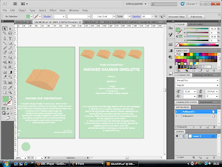
Finally- a colour I was much happier with, taking the swatch from the center (of the line of three, below the image) and reducing the gradient to 80%- making the image seem a lot softer, yet still eye-catching and bright- making the audience develop an interest and desire to read from the start.
Applying to recipe cards...
Front and back...Much happier with this colour now, and I can see what a great difference it makes side my side to the other products.
I will now go on to apply this colour, replacing the aqua tone in my previous design and re-print, also finishing my swatch book and printing my tea towels for the final module hand in on Thursday.


No comments:
Post a Comment