
Trying out designs for recipe postcards- an additional method of delivery- discussing the health benefit of the food on the front, and on the reverse side, a recipe suggestion to apply the high-energy ingredient into context.

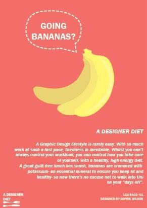
Using the same PANTONE background colour as used in previous posts- opacity slightly lowered to make the bright yellow of the bananas stand out. I decided to incorporate fun tag lines such as "gone bananas?" and "going nuts?" to pose a question and engage my reader with links to the food as well as results of lack of sleep and tiredness (as I often feel I have gone completely nuts).

Without the dashed line between the title "A Designer Diet" and the body text, the look is a lot cleaner and less fussy.


Trying out different colours for the background with the reversed-out white text. Admittedly, the colours are all very bright and a little too garish- don't work well with the pastel-like tones of the bananas. The softer aqua colour certainly works better.

Removing the 'Gone Bananas' from the top speech bubble- looks a little messy and child-like. The center alignment also works a lot better as it balances the image- whilst being careful not to widow any of the text. Using the same advisory and suggestive text that I was creating with my stickers during my paper craft works- keeping the high-energy information, with nutritional benefits, as well as applying it particularly to the Graphics course.

Adding a recipe onto the back- a suggestion of how the banana can be eaten within a meal or snack to ~liven it up~ a little, here, I am incorporating several of my design ideas- the nutritional singular food stuff focus, along with a recipe.

Again, another slight alteration- the title looks much better regular than italic- keeps a balance in the image between the regular type at the bottom of the logo and course information, and with the italicized body of text between the two.

Again, changing the type slightly- with the same lowercase Franklin Gothic Demi as opposed to Justus for the 'truly scrumptious' text at the top- looks far more consistent with the rest of the design.


Another example as I expand on to the other ingredients- this time for almonds. Not before having a recipe specifically for almonds, I created "candied almonds" which fits the high-energy, low-cost criteria I previously researched.
As and when the rest of the designs are finalized and printed, I shall blog them here.
No comments:
Post a Comment